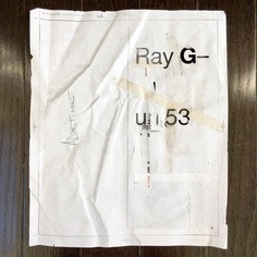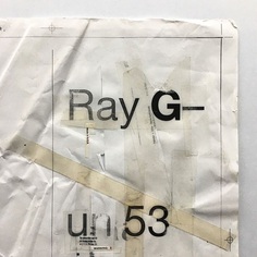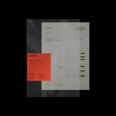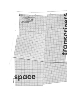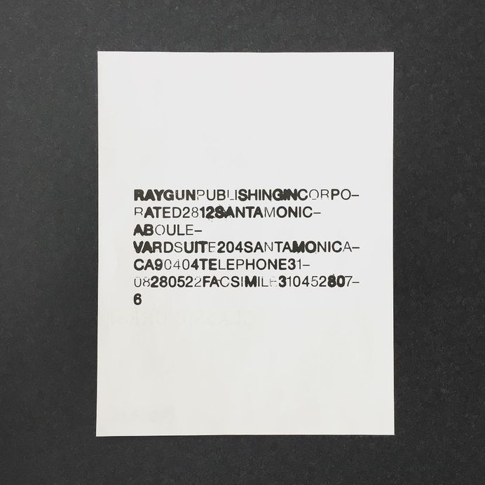
From the archive. Reverse of the Ray Gun Publishing letterhead. Late '97. Designed around the same period that I was putting together Ray Gun 51 (Janes Addiction, Nov '97) as it shares a somewhat similar typographic approach - this was the stationary used across all of the Ray Gun publishing ventures - at that time there was Stick Magazine (snowboard mag), Sweater Magazine (design direction by P Scott Makela) as well as Ray Gun, and it might also have been catching the tail end of the Huh Magazine (design direction by Vaughan Oliver) period too. It was such a wonderful experience to be seeing the creative from the other magazine teams - as their publications took shape each month. I guess there was also a little bit of competitive spirit around too which is never a bad thing for keeping you on your toes. As for the design of this piece - I started this off on the Mac before outputting and manipulating the type with scalpels and layers and layers of sellotape before scanning back in. The front side had a fluorescent panel taking up the lower third, and a black and white typographic header too. There was at least enough room for a couple of lines of a letter! #swissgrit #graphicdesign #graphics #design #type #typeinspire #typeinspired #typography #typographyinspired #sanstype #communicationdesign #raygunmagazine #swisstypography #letterheaddesign #handmadetype