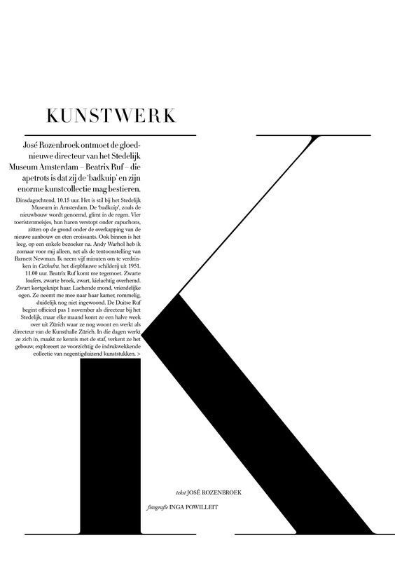
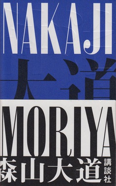
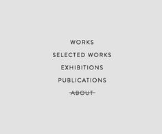
I like how the rest of the alignment of text creates the rest of the K. However if it was less text it might have been interesting to see it at same thickness as the rest. HR
Jade Chung Saved to TYPOGRAPHY